Digital accessibility is no longer an optional feature; it’s a fundamental requirement for any application or website. With an increasing emphasis on inclusivity and compliance with accessibility standards, it’s crucial for developers and designers to prioritize making their apps accessible to all users, including those with disabilities. In this article, we will explore the importance of digital accessibility and provide practical tips on optimizing your apps for a more inclusive user experience.
Understanding Digital Accessibility
Digital accessibility refers to the practice of designing and developing digital products, such as websites and mobile apps, in a way that ensures they can be used by people with disabilities. Disabilities that affect digital access include visual impairments, hearing impairments, motor impairments, and cognitive impairments. By making your apps more accessible, you enable a broader range of users to interact with and benefit from your software.
The significance of digital accessibility goes beyond just adhering to legal requirements, like the Americans with Disabilities Act (ADA) in the United States and the Web Content Accessibility Guidelines (WCAG). It’s about creating a more equitable and user-friendly experience for everyone.

Why Prioritize Digital Accessibility?
-
Legal Compliance:
Ensuring your apps are accessible is not just a good practice; it’s often a legal requirement. Failure to comply with accessibility standards can lead to legal actions and significant fines.
-
Expanded User Base:
Approximately 15% of the world’s population lives with some form of disability. By optimizing your apps for accessibility, you tap into a large and diverse user base that might otherwise be excluded.
-
Enhanced User Experience:
Accessibility features often benefit all users. For example, closed captioning benefits not only deaf users but also those watching videos in noisy environments or who prefer reading text. Well-designed accessibility features can enhance the overall user experience.
-
Positive Brand Image:
Demonstrating a commitment to inclusivity can improve your brand’s image and reputation. It shows that your company values all users, regardless of their abilities.
App Accessibility Guidelines
Here are a few guidelines that can help you create apps that are not only visually appealing but also accessible to a broader range of users, including those with disabilities, thereby improving the overall user experience and inclusivity of your applications. Let’s dive right in.
-
Have a Clear and Streamlined Layout Design
Having a well-organized and clutter-free interface is not just a matter of good UX design; it’s essential for app accessibility. A messy or distracting interface can frustrate users and make your app unusable. Elements such as calls to action and body text should be easily readable and guide users seamlessly through your app. Additionally, your app’s layout should adapt gracefully to different screen sizes on various mobile devices. Material.io offers valuable guidance on creating user-friendly app layouts. Even as accessibility advances, it’s crucial to avoid unnecessary visual elements and explore creative, interactive layout methods when appropriate.
-
Ensure Consistency in Design and Navigation
Consistency is a key principle in app accessibility. Users should find your app’s menus, displays, and overall user flow easy to follow and understand. Your app should maintain a clear and predictable structure, ensuring users always know their location within the app, regardless of the page they are on. Understanding mental models – the ways users conceptualize how an app works – is essential. Keeping core features consistently positioned allows users to navigate and access features effortlessly. Also, consider simplifying gestures and interactions, keeping in mind the limitations users may face when operating a touchscreen device. Incorporating shortcuts or alternative navigation methods can empower users and improve overall usability.
Here’s a helpful Infographic of the Pointers
-
Color Considerations and Contrast
Your app’s color scheme is a crucial aspect of its user interface (UI) design. It not only impacts aesthetics but also accessibility, especially for color-blind users. Your color palette should feature colors with a sufficient contrast ratio to ensure readability and usability. To comply with international accessibility standards like the Web Content Accessibility Guidelines (WCAG) 2.1 AA, text should have a minimum color contrast ratio of 4.5:1. Your colors should be easily distinguishable from one another and maintain a consistent theme throughout the app. Additionally, keep in mind that users will use your app in various lighting conditions, so optimizing contrast levels is essential for usability.
-
Enable Inclusive Audio and Visual Elements
While color plays a significant role in app accessibility, it should not be the sole means of conveying information or features. With an increasing number of users relying on screen readers (text-to-speech), it’s essential to provide alternative methods of communication. Features like subtitles and audio descriptions are crucial for users with hearing impairments or visual impairments.

Similarly, incorporating audio and visual elements should be done with inclusivity in mind. Providing features such as windowed views, full-screen options, play/pause controls, captions, and volume adjustments are relatively simple but tremendously beneficial in giving users control and access to your app’s content and functionality.
Practical Tips for Optimizing Digital Accessibility
It is vital for businesses to prioritize accessibility from the app development process itself. This helps organizations not only comply with legal requirements but also create a more inclusive and user-friendly experience for all users. Here are a few practical tips that go a long way in optimizing apps for Accessibility:
-
Familiarize Yourself with Accessibility Guidelines
Business leaders and quality heads need to become familiar with the WCAG guidelines (currently at version 2.2), which provide a comprehensive framework for web accessibility. These guidelines cover various aspects, including text alternatives, keyboard accessibility, and content structure. Familiarizing ourselves with the guideline helps us lead the teams to think about accessibility from the start, instead of struggling later during the iterative phase.
-
Prioritize Keyboard Navigation
Ensure that all interactive elements in your app can be accessed and used using only a keyboard. This is essential for users who rely on keyboard navigation due to motor impairments or visual impairments.
-
Use Semantic HTML
Use semantic HTML elements to define the structure of your app. Semantic elements like headings, lists, and forms provide context for screen readers and help users understand the content and navigation flow.
-
Provide Alt Text for Images
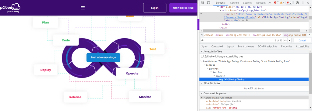
Include descriptive alt text for all images in your app. Alt text helps screen readers convey the content and purpose of images to users with visual impairments.

-
Implement ARIA Roles and Attributes
Accessible Rich Internet Applications (ARIA) roles and attributes can enhance the accessibility of complex web components, such as sliders, accordions, and modals. Use them appropriately to provide additional information to assistive technologies.
-
Test with Real Users
Conduct usability testing with individuals who have disabilities. Their feedback is invaluable for identifying accessibility issues and making necessary improvements.
-
Ensure Video and Audio Accessibility
For multimedia content, provide captions and transcripts for videos and audio. This benefits users with hearing impairments and anyone in a noisy environment.
-
Optimize for Mobile Accessibility
Pay attention to mobile accessibility, ensuring that your app is usable on various mobile devices. Implement responsive design and consider touch gestures for users with mobility impairments.
-
Monitor and Update Regularly
Digital accessibility is an ongoing process. Regularly test and update your app to address emerging accessibility challenges and incorporate improvements as technology evolves.
Conclusion
Optimizing your apps for digital accessibility is not merely a best practice; it’s a necessity in today’s digital landscape. Ensuring that your applications are usable by people with disabilities is not only a legal requirement but also a commitment to inclusivity and user satisfaction. By adhering to guidelines and various pointers mentioned here, we can create apps that cater to a broader audience, including those with disabilities. This not only enhances the app’s user base but also cultivates a positive brand image and delivers an improved user experience for everyone. It is vital for every business leader to remember that digital accessibility is not just a one-off exercise but a continual change process. Regular monitoring, testing, and updates are essential to keep pace with emerging challenges and evolving technology. By prioritizing accessibility, you contribute to a more inclusive digital world and ensure that your apps are accessible to all, regardless of their abilities.
Ensure Complete Test Coverage
Test your apps on 5000+ real device and browser combinations and ensure a complete test coverage.

 September 22, 2023
 August 18, 2023